SteelMaster, Remastered: Our New Look and Website
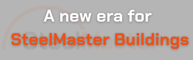
The Journey Continues for SteelMaster Buildings
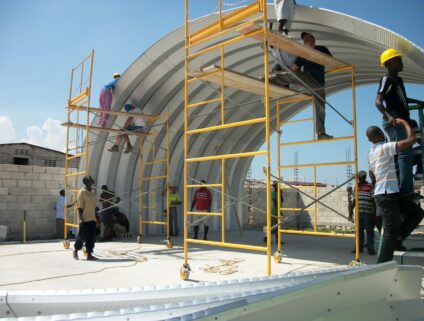
For over 40 years, SteelMaster Buildings has been one of the leading prefabricated arch style buildings in the business. Our brand name is synonymous with strength, style, and value. Over the decades, our company has evolved and so has our team. Therefore, our brand evolved too.
Since the beginning, we have valued each customer. And now we are excited to announce a brand refresh with our customers in mind. Our logo, color palette, and most importantly our website, have all experienced a make-over to give our customers a more user-friendly experience.
Read more to learn what this means for our business and our customers.
New Look, Same Product
For you, the customer, not much will change. Our commitment to providing customers with the highest quality products and overall experience will remain our priority.
We are celebrating the fact that we have remained a leader in the industry for four decades with this new visual identity. A bright, energetic, visual language that is both friendly and approachable for our customers while introducing a sleeker design.
“As the world-leader in the Quonset-style building space for over 40 years, it was important for us in the redesign to incorporate the unique arch shape into the logo as the strongest structural shape known to humankind. Ultimately, we aspire to provide [our customers] with the highest quality, Quonset-style arched steel buildings in the marketplace,” said SteelMaster Buildings’ Director of Marketing, Michelle Wickum.
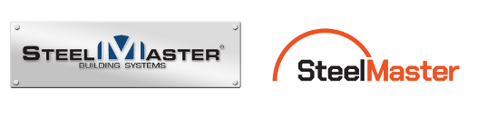
Smoother Design
We deconstructed the original logo while maintaining its integrity.
The arch is more rounded giving it a warmer feel. And, instead of “Building Systems,” we changed the verbiage to “Arch Buildings,” because arch buildings are our expertise.
Why Orange?
Color plays a significant role in audience recognition and has a physiological impact on consumer’s moods. Choosing a color for our rebranding was not a decision we took lightly.
Our goal was to choose a color that would evoke a feeling of boldness and adventurousness; something for which we have always strived.
Michelle added, “We want to clearly communicate our company’s core values through the selection of new brand colors symbolizing our mission to engage user interest in our structures and to better understand our customers’ needs.”
Website Capabilities
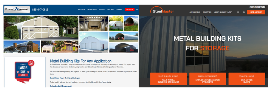
Not only did we upgrade our look, most importantly we upgraded our website capabilities. Our new and improved website will offer our customers faster speed, a sleeker design, and overall improved user experience.
“Our goal with this new website is to deliver to our visitors an easier way to learn about SteelMaster’s product features and benefits and to allow those that come to the site the most robust collection of arch building information found anywhere. Our current and prospective clients will find useful data and images about our building design, materials and engineering allowing them, with the support of SteelMaster’s Design Specialists, to make their Quonset-building-dream a reality,” concluded Michelle.
If you are already a part of the SteelMaster family, we want to thank you for supporting our business through our evolution. We will strive to provide our customers with the highest quality steel on the market, top-notch customer service, and long-lasting relationships with our customers, all with our fresh look.
Categories
Related articles
Announcing the Winners of the 2025 SteelMaster Photo Contest!
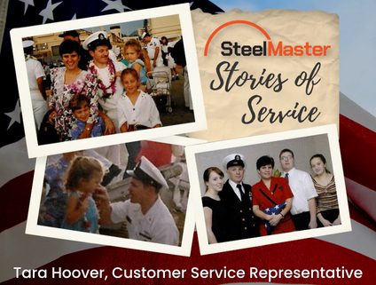
SteelMaster Stories of Service: Customer Service Representative Tara Hoover

SteelMaster Stories of Service: Hannah Lissberger

SteelMaster Stories of Service: Sales Manager Mike Harmon

SteelMaster Stories of Service: Desiree Vasquez
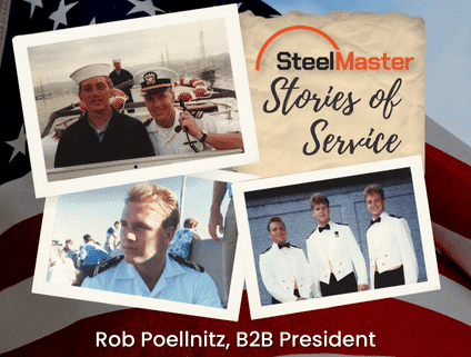
SteelMaster Stories of Service: B2B President Rob Poellnitz
The Stories Behind the 2025 SteelMaster Buildings Calendar
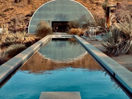
Understanding State-Stamped Blueprints vs. Factory Blueprints for Metal Buildings
Simplifying Remote Building Projects: A Guide to Creating Your Ideal Retreat